Friday, 23 January 2015

Designing


I have been progressing with designing and my designs are looking very floral and the colours are also looking very neutral. I didn't think I wanted a floral kind of theme throughout my work I was kind of steering away from that look, but as I am designing I am seeing myself producing this theme and I am enjoying designing them.


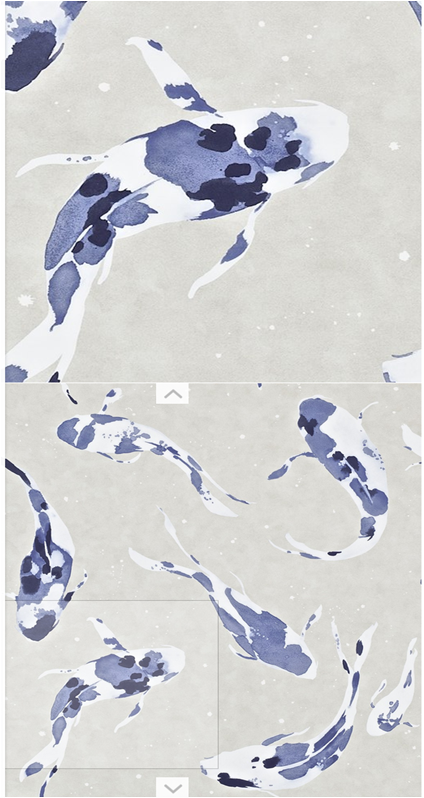
Here is one floral design I have chosen to show, it shows the neutral and floral theme that is almost continuous throughout the early designs.  


Here are two other designs I'm working on what show more of a textural look, I thought of trying some more designs that show my surface in the collection would really connect things together. 
Having floral designs would show that I maybe my brief is only floral and that's what I intended when it is not, taking a step back and looking at what I had produced I wanted to add some more textural designs. 


Wednesday, 21 January 2015

Anne Kyyro Quinn


Keeping up with my contextual research Anne Kyyro Quinn makes her wallpaper designs look like they are 3D and are coming off the wall, I also like they her wallpaper is the the places where I never would of thought to look out for wallpaper. 


This looks like more of a personal home cinema, but it shows that Quinn has thought about who she is designing for. Giving a 3D effect to the walls when the client would be sat watching maybe a 3D movie. Its really made me think towards the future and how I really would need to think about who and what I am designing for, to come up with the perfect design for them. 

Sunday, 18 January 2015

Boyle Family

Throughout the project I have been finding new surface and texture inspiration to help me throughout the project whilst drawing and now I am into the designing stage I think this is really helping me.


The Boyle Family can give me different surface and texture inspiration, rather than looking at natural surfaces. I can see all the different lines and shapes so they can help me when designing to think about how to put my different motifs on the page. 

Development on Designing

I have recently been putting my photographs into Photoshop so I can start designing. Picking out the shapes so I can see them in different colours from my colour pallet is really helping me to see how my colours look and work within different shapes. 


Doing this before getting straight into designing I can see how big or small I want the shapes and also the colour. This process is even helping me discard of any shapes within the photographs that I don't think suit the look I am going for, which is Natural and subtle shapes. 

Tuesday, 13 January 2015

Final Colour Pallet Choices


Researching recent colour trends has really helped me come up with my two final colour pallets for my first collection:


The colour pallets both show neutral tones with some changes in the main bolder colours. 

For my second collection I knew I wanted something completely different, something bold what stands out to show I can design different style collections from the same drawings and research:


Harlequin Wallpaper Range


Throughout the project I want to be researching the new wallpapers that are being designed to give me a sense of how to design my own, with what to do and what not to do. Harlequin is a company that I research frequently, as they always have new fresh collections that inspire me. 

They have different collections such as: plains, stripes and also floral, with many more. 

I look at Harlequin as a company where I would like to see my own work as they also do fabric collections to bring their customers a full range of products.


Exploring the different collections of Harlequin can help me see the differnet diverity of the collections, how they show there work, the names of the collections and also how professionally they present. 

Sunday, 19 October 2014

Reflective Post


 'digital drawings'

Firstly I went on a walk around my area and was looking for surface inspiration, something different to my Fletcher and Moss garden photographs which I had been working from and I thought instead of photographing I would collect surface inspiration. This would be a different way for me to get visual surface inspiration and would challenge me as I have never thought about surface when collecting things before. 
My normal photographs of the collected things were not really showing surface to me, I wasn't inspired by them and then I thought of the Threshold technique on Photoshop and I loved the results:


The effect changed the 3D object to a flat surface image. This is the effect I like, that inspires me and also gives me development ideas: Can I do some screen printing? Would I find that I do enjoy screen printing to see the effect? Lightbox - pulling the marks out of the photograph.

The Threshold technique was so useful to me that I thought I would put some of my Fletcher and Moss photographs into it:


I have put this technique to good use this week and I can also keep on developing from it.